
.png)
Project Overview
This project was a large-scale internal initiative focused on redefining the company’s brand positioning, marketing strategy, and digital experience. It involved close collaboration with an external marketing agency (Bullshark) while being owned in-house. As the internal Marketing and UX lead, I managed the project from a strategic and usability perspective. My role included coordinating stakeholders, guiding the project direction, conducting UX research and usability analysis, performing a UX audit, and shaping the SEO and content strategy to improve the platform’s discoverability and user experience. I ensured that the final deliverables aligned with both business objectives and user needs while maintaining consistency across the brand’s digital presence.
The Problem
The company needed a cohesive and scalable digital presence that aligned brand identity, marketing strategy, and user experience. Existing touchpoints lacked clarity, consistency, and a unified direction, making it difficult to clearly communicate value and support long-term growth.
The Goal
Acting as the in-house owner, I translated business goals into actionable UX and content decisions while coordinating execution with an external marketing agency. The solution focused on creating a structured, scalable digital experience that balanced strategic clarity with practical execution. This included defining UX principles, guiding visual and content direction, validating agency deliverables, and ensuring consistency across all touchpoints.
Key Highlights
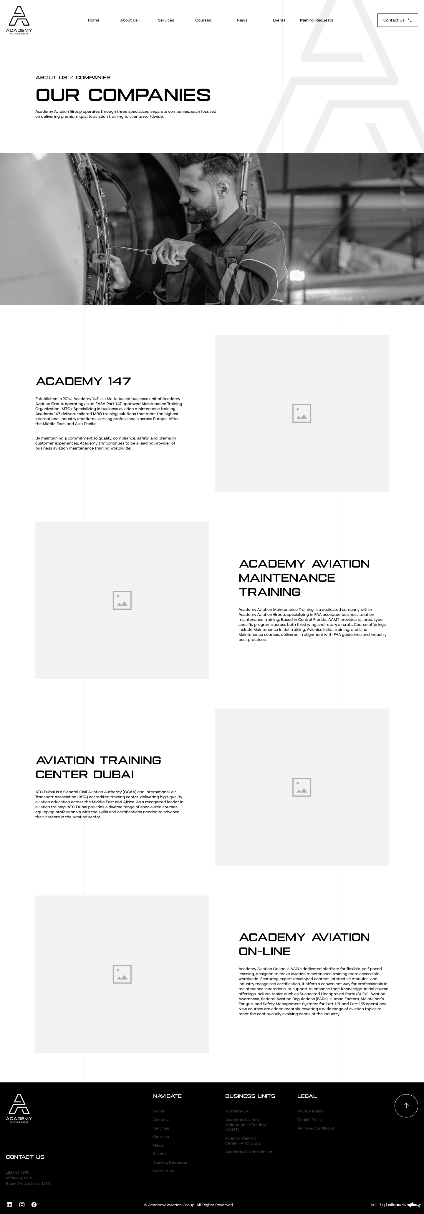
Multi-Company Aviation Ecosystem
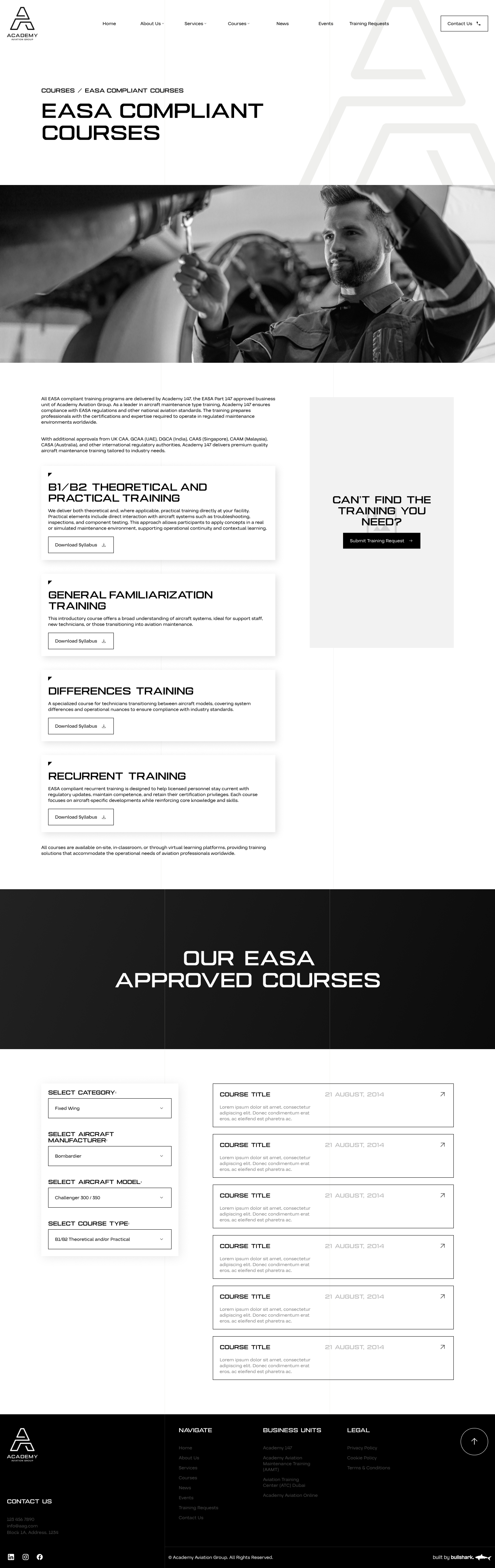
Structured Aviation Training Courses
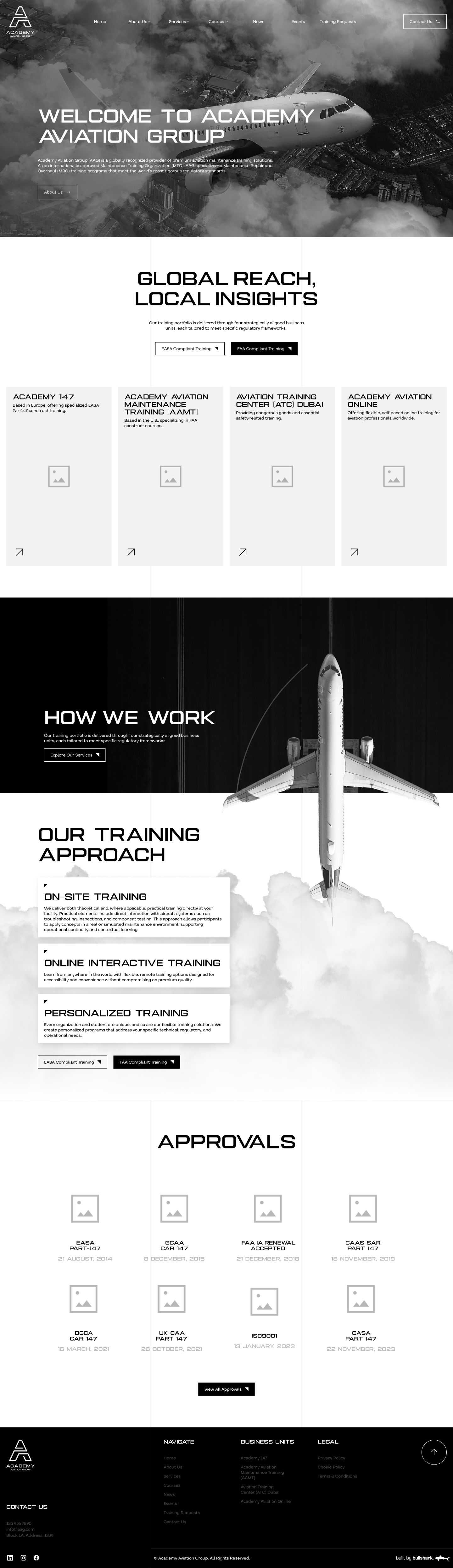
Global Aviation Training Platform
Aproach & Methodology
We began with internal workshops and stakeholder meetings to understand the existing digital landscape, business objectives, and operational challenges. This phase focused on identifying pain points caused by maintaining two separate websites for FAA and EASA training, as well as understanding user needs, content gaps, and scalability requirements. Competitive research and internal audits helped define opportunities for consolidation and improvement.
Based on insights from discovery, we defined a clear project scope and UX strategy. This included deciding on a unified information architecture, clear separation of FAA and EASA training content, and consistent brand representation across the group. User journeys, content priorities, and navigation logic were mapped to ensure clarity for different audience segments while supporting business and SEO goals.
During development, I led UX decisions and closely reviewed external agency deliverables to ensure alignment with the defined strategy. This phase included content structuring, wireframe validation, design feedback, and iterative refinements. I collaborated across internal teams to approve content, guide visual direction, and ensure the platform was scalable, responsive, and easy to maintain.
The final phase focused on launch coordination and post-launch optimization. I oversaw content approvals, ensured SEO best practices were implemented, and supported the transition to a single unified platform. After launch, I continued maintaining the website through ongoing content updates, SEO optimization, and visual enhancements, ensuring long-term performance and consistency.

b.png)
.png)
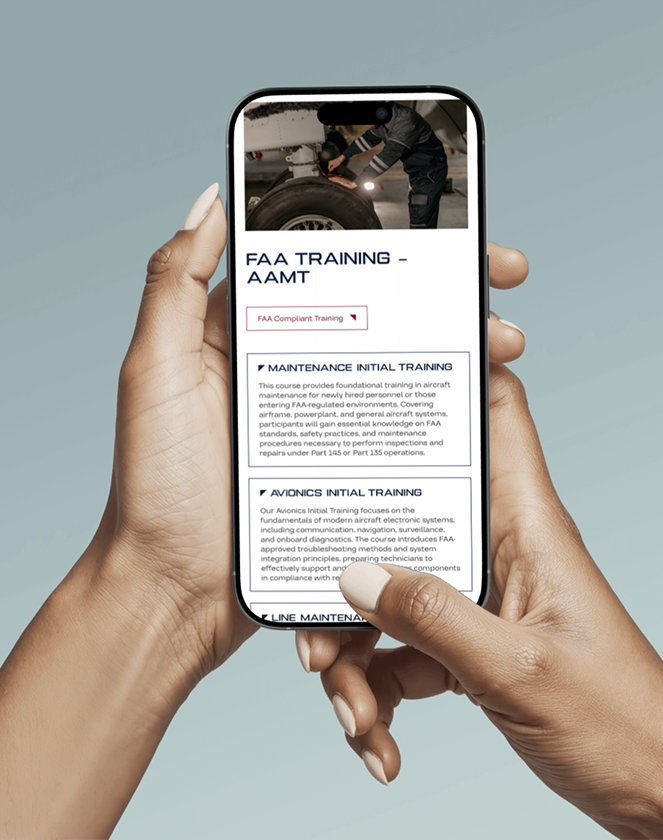
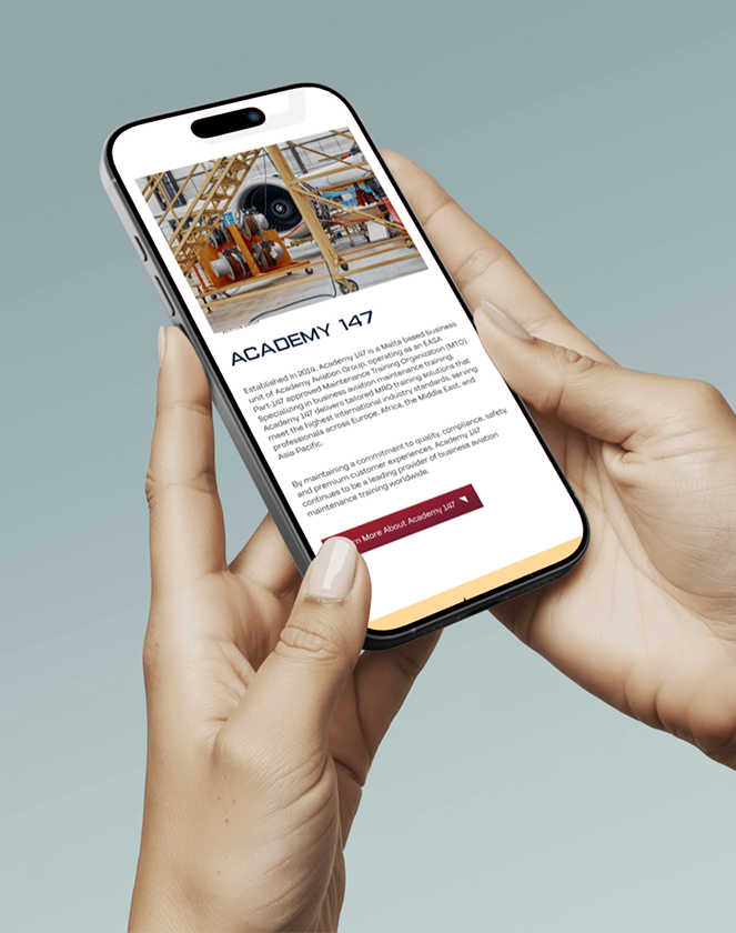
Responsive Mobile Experience


.png)

UX Usability Audit & Findings
This interactive Figma case study showcases a UX usability testing framework designed to uncover hidden friction in complex, regulation-driven websites. It breaks down real-world user journeys, identifies high-risk usability failures, and translates them into clear, implementation-ready UX recommendations. Open the file to see how heuristic UX analysis can drive measurable improvements without redesigning the entire experience.


.svg)
.svg)