
How to Give Designers Useful Direction and Feedback Without Becoming a Designer
If you work in sales, operations, leadership, or any non-design role, you’re not “bad at design”. You’re just speaking a different language.
And yet, your input is essential—because design doesn’t exist for designers. It exists to move a business goal forward, for a real audience, in a real context.
In my experience as a creative experience designer, the difference between a smooth, confident launch and a frustrating loop of revisions is rarely talent. It’s almost always alignment: clear direction up front, and feedback that ties back to the goal (not personal preference). That alignment starts with two things:
- a design brief that sets direction, and
- a feedback method that improves the work instead of stalling it.
Communication is part of the job, not a “nice-to-have”
Most cross-functional friction isn’t because anyone is doing the wrong work—it’s because different teams are working from different assumptions, in different places, at different times.
Project and programme research repeatedly highlights communication as a key predictor of project performance, and treats it as a core competency—especially in environments where many stakeholders contribute to one outcome.
The practical takeaway for design work is simple: reduce noise and increase clarity by creating a single place where the “latest truth” lives—decisions, files, feedback, and status in one visible record. This is the “single source of truth” concept, and it’s widely recommended because it reduces ambiguity and prevents version drift.
When communication is fragmented (emails here, WhatsApp there, comments in a deck, a late call with “one more change”), it doesn’t just feel messy—it creates real delivery risk.
A design brief is not paperwork. It’s the roadmap.
A design brief (also called a creative brief) is a short document that outlines objectives, target audience, and constraints so the designer can make the right decisions without guessing.
The most important thing to understand is this:
A good brief provides direction, not a pre-made concept.
Adobe makes this point explicitly: a creative brief should guide the work, rather than prescribing specific creative ideas or concepts.
When briefs are clear, they do three things that matter to non-design stakeholders:
- they align people who care about different things (sales, operations, leadership, marketing),
- they streamline production because the designer isn’t re-learning the basics during review, and
- they avoid miscommunication, because the brief becomes the shared reference point.
What you should provide vs what the designer should create
Here’s the cleanest mental model I’ve found for non-design teams:
You provide direction
Think: Where are we going and why?
- Goal: What outcome do we want? (book meetings, generate enquiries, recruit instructors, drive registrations, etc.)
- Audience: Who must act—and what do they care about?
- Message: What do they need to understand quickly?
- Call-to-action: What should they do next?
- Constraints: What must be included? What is non-negotiable?
- Context: Where will this live (channel, format, location, timing)?
That’s brief territory. It gives clarity without dictating execution.
I create the concept
Think: How do we make it land?
- storytelling and visual concept
- information hierarchy (what you notice first, second, third)
- choosing imagery style and tone
- layout, typography, composition, and variants per channel
This is why you don’t need to write “Use a photo of ...” or “Make it feel modern”. If you tell me the audience and goal, the concept becomes my responsibility.
A concrete brief example-and what the designer does with it
Here is a realistic example that shows the difference between direction and concept.
The requestor’s brief (direction)
- Goal: Generate 60 qualified enquiries and book 12 meetings within 30 days.
- Audience: Maintenance and training decision-makers in a specific aircraft-operator community (an “OEM ecosystem” audience).
- Key message: “Regulatory-aligned maintenance training delivered by instructors with real aircraft experience.”
- CTA: “Book a meeting” / “Scan QR to enquire”.
- Asset set: 1 roll-up, 2 social images, 1 email header.
- Must include: Group brand first, featured unit second; dates/location; QR; contact email.
- Constraints: Premium technical tone; readable fast; no clutter.
That’s enough for a designer to work confidently—because it sets the target, the promise, the next step, and the constraints.
The designer’s concept notes (solution)
- Storytelling approach: Lead with credibility (brand + regulatory cues) → prove relevance (training reality) → drive action (CTA + QR).
- Imagery direction: Choose visuals that feel native to maintenance decision-makers (environment, tools, training action), not generic stock “business” imagery.
- Hierarchy rule: Headline must be legible quickly; supporting text trimmed to one proof point; CTA obvious.
- Channel variants: Digital prioritises mobile legibility; print prioritises distance readability.
Notice what’s not required from the requestor: picking fonts, editing layouts, or dictating the image.
Feedback is not taste. It’s a check against objectives.
This is the shift that changes everything.
A design critique is not simply “judging a design”. It’s analysing whether the design meets its objectives and improves through discussion.
When feedback turns into “make it pop” or “I don’t like this colour”, the team gets stuck in taste-based debate—and taste isn’t measurable.
NN/g also points out that critiques often derail when comments become hypothetical or unactionable. Good critique stays anchored to goals and becomes actionable.
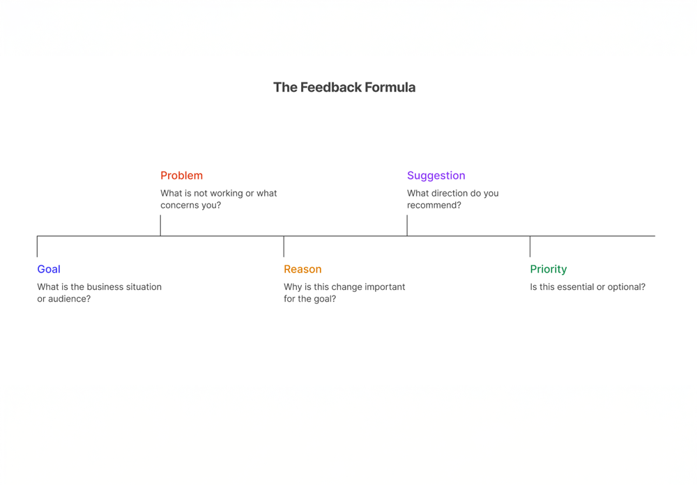
The feedback formula I teach non-design teams
Use this structure (it takes seconds, and it’s gold for designers):
Context → Problem → Reason → Suggestion (optional) → Priority
This style mirrors constructive feedback best practice: be specific, anchor comments in observable facts, and make them actionable.
Bad feedback (hard to act on)
- “It doesn’t pop.”
- “Make it more modern.”
- “Can you change the picture?”
Good feedback (goal-based and clear)
- Context: “This will be viewed on mobile in a LinkedIn feed.”
Problem: “Too much text to read quickly.”
Reason: “We lose the message before the CTA lands.”
Suggestion: “Reduce to one headline + one proof point.”
Priority: Must-change. - Context: “This roll-up must be readable from 2–3 metres.”
Problem: “Headline feels too small.”
Reason: “People won’t understand what we offer as they pass by.”
Suggestion: “Increase headline size; remove the paragraph.”
Priority: Must-change. - Context: “Audience cares about compliance and credibility.”
Problem: “Regulatory proof is easy to miss.”
Reason: “It weakens trust for this buyer.”
Suggestion: “Bring the accreditation line closer to the headline.”
Priority: Should-change.
That is feedback that improves outcomes.
A review routine that protects speed and sanity
Two operational rules protect time, budget, and team energy:
Keep feedback in one place
When comments are split across emails, chats, and decks, people end up reviewing the conversation instead of the work.
If your collaboration tool supports proofing (comments directly on the file), use it. It keeps context attached to the deliverable and creates a traceable feedback trail. ClickUp, for example, supports proofing comments on common file types in-platform.
Consolidate feedback (“one voice”)
Nothing destroys momentum like five people giving five different directions.
If you have multiple stakeholders, nominate one person to consolidate comments into a single set per round. This is one of the simplest ways to prevent critique sessions from derailing into contradiction and rework.
Use a clear review cadence
A lightweight, predictable cycle prevents endless loops:
- Round 1: Consolidated feedback (directional + corrective)
- Round 2: Final corrections only
- Final: Approve and release
This also helps manage scope creep: when changes continue indefinitely, delivery slows and quality often suffers. PMI’s guidance on scope creep emphasises protecting the baseline and not accepting additional work without clear agreement that it’s in scope.
Figma’s writing about feedback culture captures a real workplace dynamic: people often jump into work with little context, comment quickly, then disappear—creating churn instead of clarity. A structured routine solves that cultural problem without blaming anyone.
A final checklist before you send direction or feedback
If you’re not a designer, here’s the simplest way to be an outstanding design partner:
- Can I state the goal in one sentence?
- Have I defined the audience clearly (role, region, context)?
- Is there a single CTA (one action)?
- Did I give feedback using Context → Problem → Reason → Priority?
- Did we keep feedback in one place and as one consolidated voice?
When those five are true, design work becomes faster, calmer, and more effective—without anyone needing to learn kerning or colour theory.
And as a designer, that’s exactly the kind of collaboration that lets me do my best work: turning your business direction into a concept that your audience understands, trusts, and acts on.
Popular Post


Categories
- Research Insights (02)
- Laboratory Best Practices (04)
- Innovation & Technology (01)
- Industry Trends (03)
- Sustainability in Science (05)
- Events & Workshops (02)
- Educational Resources (04)


.svg)
.svg)